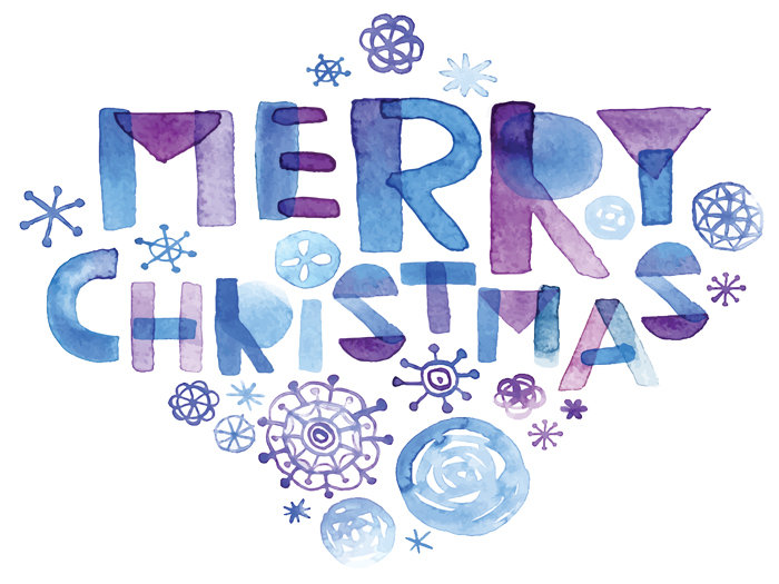
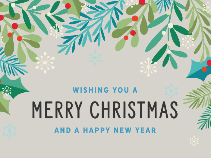
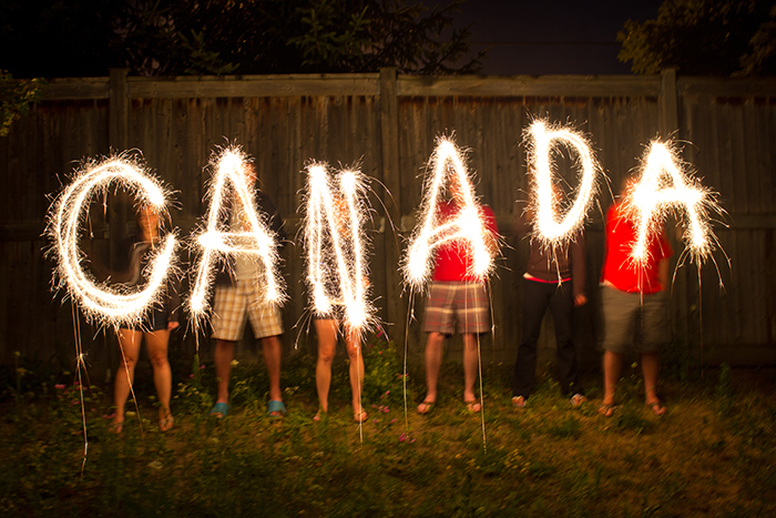
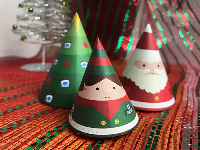
From the whole Direction Team, we wish you a very Merry Christmas & Happy New Year! Thank you to all our amazing clients and we look forward to working with you in the new year!
Direction Printing at 2:19 PM
Blog
Celebrating 30 Years!
Thursday, June 12, 2025
Celebrating 30 Years!
Thank you to all our amazing clients! We are truly honoured to have had the opportunity to work with you over the years and look forward to many more in the future!
The Power of Print: Unleashing the Potential of Call-to-Action in Brochure Marketing
Wednesday, December 13, 2023
In today's digital age, where online marketing dominates the landscape, the importance of traditional marketing strategies should not be overlooked. One such classic yet effective tool is the brochure, and within its tangible pages lies a crucial element that can make or break a marketing campaign – the Call-to-Action (CTA). In this blog post, we'll delve into why printing a compelling CTA in brochures is an indispensable aspect of successful marketing.
Tangible Engagement:
In a world saturated with digital content, a well-designed and printed brochure stands out. When your audience physically interacts with a brochure, they engage on a more tangible level. Incorporating a clear and persuasive CTA within its pages compels readers to take action immediately.
Guiding the Customer Journey:
Brochures are like roadmaps, guiding potential customers through the journey of your products or services. A strategically placed CTA acts as a signpost, directing readers on what steps to take next. Whether it's making a purchase, signing up for a newsletter, or visiting a website, the CTA drives the narrative of the customer's interaction with your brand.
Building Brand Recall: The act of physically holding a brochure and responding to a CTA creates a memorable experience. This tactile engagement contributes to stronger brand recall compared to fleeting digital interactions. A well-crafted CTA reinforces your brand message and becomes a memorable part of the consumer's journey.
Personalization and Targeting: Print materials, including brochures, provide a unique opportunity for personalization. Tailoring your CTA to a specific audience enhances its effectiveness. By understanding the demographics and interests of your target market, you can create CTAs that resonate with them, increasing the likelihood of conversion.
Creating a Sense of Urgency: A printed CTA has the power to instill a sense of urgency. Phrases like "Limited Time Offer" or "Act Now" printed on a brochure can prompt immediate action. The tangible nature of a brochure makes it easier for readers to grasp the urgency conveyed in the CTA, driving quicker responses.
Complementary Role in Multichannel Marketing: While digital marketing channels are essential, they are most effective when integrated with traditional methods. Brochures with well-printed CTAs complement online efforts by providing a physical touchpoint in your overall marketing strategy. This synergy reinforces your message across different channels.
Conclusion: The art of printing a compelling Call-to-Action in brochures is a time-tested marketing strategy that continues to yield results in the digital age. The tangible nature of brochures, coupled with a persuasive CTA, creates a powerful tool that engages, guides, and converts potential customers. As you navigate the dynamic landscape of marketing, don't underestimate the impact of a well-printed CTA in the hands of your audience.
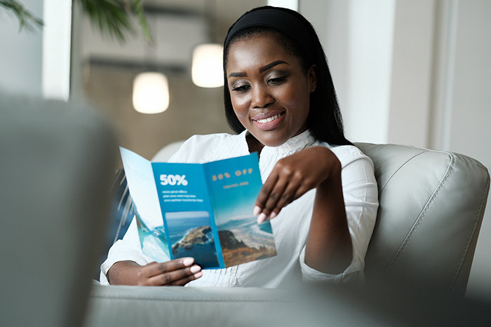
Trade shows and events can be a great way to network and gain awareness for your company outside of typical marketing. They allow you to get more personal with potential customers, talk face to face, and give them incentive to come back later. One of the best ways to ensure that you aren’t forgotten after they leave your booth is brochures.
Brochures have been used for years as a way to market beyond just your booth at an event. They allow you to stay in customers’ minds for longer and share important information about your company.
Not only that but brochures allow you to use both text and images to sell your brand. They also help you tie in all aspects of your company. This is why brochures still matter and how you can make your standout at a trade show.
Why Brochures Still Matter
You may be asking, but do brochures even matter anymore? How many people actually use them or read them? Well, you would be surprised.
When you are at a trade show you have maybe 5 solid minutes to sell your company to a new customer. Then they will walk away to another booth or get distracted by something else. Trade shows are busy, and the floors are typically packed, so what do you do when someone walks away after only a 5-minute sales pitch? You give them a brochure.
Brochures are a great way to continue selling your brand. They are small and easy to hand out while you are talking to someone. Or you can have them displayed on your booth so people can grab them before they leave. Or have someone hand them out to people passing by that don’t have time to stop. They allow you to stay in someone’s mind even after they leave. They also allow people to continue to revisit your brand when they have more time after they get home.
Brochures are still very relevant today. Even with technology being people’s main go-to for marketing, brochures can still be very helpful. A lot of times people attending these trade shows still prefer to have some form of physical media to take with them. Or depending on your target audience, they may prefer physical media to technology. So, don’t discredit brochures, as they are still the number one selling tool for trade shows and events.
Tips for Making a Good Brochure
Not only is it good to have brochures to hand out at events, but they also need to be relevant, eye-catching, and useful to the reader.
Sure, you could simply whip something together on your office computer and print it off at work. But most of the time, it won’t look great, and it will be poor quality if you are using plain printer paper.
Consider using someone on your design team or hiring outside help to create an eye-catching and good quality brochure. Then, once you have one go to a good printing company, like Direction Printing, and ask to have it printed in the best quality.
Your brochure doesn’t just need relevant information it also needs to look nice and be high quality if you want people to hang on to it.
Here are our tips for creating a good eye-catching brochure to hand out at your next trade fair.
Eye Catching Front Cover
The first thing people are going to see when they look at your brochure is the cover.
It needs to stand out from every other brochure that is going to be handed to them, so you need to create a standout cover with engaging visuals.
It should be bold and colourful and reflect your target audience as well as your company.
The cover of the brochure should set the tone for the rest of it. If the cover is boring, people are going to ignore it and move on to something else. However, if it is intriguing, people are going to want to keep reading.
Start by including an image. It should reflect your company, so either your logo or a product or something designed specifically to represent your company or brand. It should also capture the attention of your target audience. If you are targeting Gen Z, maybe make it bolder and more colourful. If you are targeting people over 50, maybe don’t include memes or Y2K design elements.
Perhaps consider working with a graphic designer to help you design an image or graphic for your front cover. This is not something you should be putting together at the last minute on an old laptop. This needs to look professional as it is a direct reflection of your company. By working with a professional designer, you can ensure that it not only looks good and professional but that it is also of great quality.
Consistent Branding
It is one thing to have your brochure look good and capture the attention of your audience, but it should also match the rest of your branding.
If your company colours are blue and orange and your brochure colours are pink and green, that doesn’t really match. You need to have consistency across all forms of marketing and branding. If it is off, then it makes you as company look bad and like you don’t care.
Not only should the colour scheme match the rest of your branding but everything else should as well. Use the same font you use everywhere else. Don’t suddenly change your logo or key features of your branding. The key is for it to blend in with everything else.
Perhaps consider using the front of your brochure as the model for larger posters around your booth. That way it not only matches your brand but also the rest of the booth and makes that connection mentally for your customers. It will also help them remember which booth they got the brochure from as the image of the poster will pop back up in their minds. This also helps create brand awareness.
Focus on Your Reader’s Needs
A brochure, of course, is not all about visuals. The content inside is the main feature and therefore a lot of thought should go into it.
A brochure needs to keep selling when you can’t. So, it should talk about what your company does, what you sell, how much it costs, and potentially even new deals or products you just added.
However, none of these matters if the customer doesn’t want to buy it or can’t see how it benefits them. Rather than talking about you or your company, talk about how you or your company can help the customer. Customers don’t care unless they can see how something benefits them. Whether it be saving them time or money or even both, they don’t care unless they can see that. Target the brochure to your audience and focus on what your audience needs.
Include a Call-to-Action
After someone is done reading your brochure, what do you want them to do next? Do you want them to give you a call? Go to your office for a consultation? Email a sales representative? Follow you on social media?
You need to consider this when making your brochure because you will need to include a call-to-action.
Ideally you should include multiple calls-to-action that are subtly placed throughout the brochure with one final obvious one right at the end. However, if you are unsure how to do this, one obvious call-to-action right at the end will also do just fine. It should be easy to read, clear what you are asking them to do, and be followed by clear instructions.
It's one thing to ask someone to give you a call or email or visit your website, but if they can’t figure out how to do that then what’s the point. Make sure you are being extremely clear you don’t want them to have to put in any extra work to find the information.
Some key things to ensure you are included are your phone number (company or personal), email address, physical address of your office, social media accounts, and your website address. Make sure these are easy to read and easy to find, typically at the bottom of the last page is a good idea.
Link Them Online
Finally, a good idea is to link people back online. Most of the world revolves around the internet these days and it’s not going anywhere anytime soon.
So, making sure to link people online is a safe bet. Not only are most people already online all the time, but it allows your customers to continue learning about your company. If they follow you on social media, then they will be reminded of you every time you make a post. If you link to your website, then they can continue to learn more about you and potentially buy your products or service right away if you sell online.
A great way to link your brochure back to the internet is through a QR code. Then people can simply scan it without having to type anything into a search engine and be brought straight to whatever you want. It also means they can continue to rescan it whenever they want.
We hope this was helpful and informative on why brochures still matter for trade shows and events. If you are interested in printing some brochures of your own, give us a call or email today and we can get you started.
Tom Anderl at 9:00 AM
Blog
Merry Christmas 2022
Tuesday, December 20, 2022
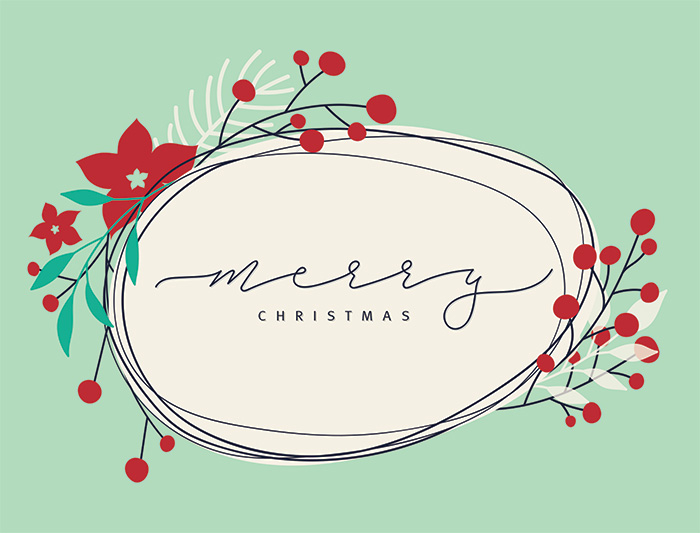
Wishing all our amazing clients and partners a Merry Christmas and Happy New Year!
We appreciate the opportunity to work with you and look forward to 2023!
Direction Printing at 1:15 PM
Blog
Merry Christmas 2021!
Friday, December 24, 2021
Thank you to all of our amazing clients from everyone at Direction. We appreciate the opportunity to work with you and we look forward to 2022!
All the best for a Merry Christmas and Happy New Year!
Following a day of working online, people are looking for physical distractions. They’re checking the mail, reading again, getting outside – and, of course, shopping.
If you’re debating, consider this – people are home and people like receiving mail…(not bills ;)…so now’sthe time to get their attention offline with your marketing pieces!
Connect with us today. We’ll help to get your products into your customers hands.
Some statistics to keep in mind (from Newswire and Statistics Canada):
In 2020, a study showed that 95 percent of consumers believe supporting small business is key to keeping our economy healthy. If you are a small, local business, let your neighborhood know.
In 2020, online e-commerce DOUBLED in Canada. If you’ve developed a new website or way of purchasing your products online, you should be telling as many potential customers as possible.
Shannon Forrest at 10:41 AM
Blog
Merry Christmas 2020!
Wednesday, December 23, 2020
From the whole Direction Team, we wish you a very Merry Christmas and all the best for a happy and safe New Year!
Tom Anderl at 1:27 PM
Blog
Ready to Open Your Doors?
Thursday, July 9, 2020
With the rise of COVID-19 we are all needing to do our part in being socially responsible citizens.
We can help to ensure your operations run safely and in accordance to current health guidelines / bylaw requirements with various COVID products for your business / public space.
We are offering various products (floor decals, window clings etc.) completely customizable to suit your branding/needs, plain/generic options or we can produce them to the artwork created for your Region. Easy application and removable.
Contact us today and one of our friendly, helpful sales staff will be happy to discuss what your needs are and how we can help to get you back up and running.
How your brain takes in printed vs. digital information
Thursday, February 6, 2020
How your brain takes in printed vs. digital information
We came across some interesting articles on an industry publication website (PrintCAN) and the related Canada Post blog entry about how your brain works when exposed to marketing messages. A team of neuroscientists looked at how subjects interacted with direct mail (printed pieces) vs. various digital marketing and how they can work together. This is reportedly a first in this this kind of study and their 2 main questions were:
What is the best media mix to optimize consumer attention, engagement and response?
What sequence works best when using digital and direct media channels?
A review of their resulting whitepaper, “A Bias for Action”, PrintCAN boiled down some key findings:
1) Direct mail is easier to understand and more memorable than digital media. It takes 21 per cent less thought to process, and creates much higher brand recall.
2) Direct mail is far more persuasive than digital media. Its motivation response is 20 per cent higher — and even better if it appeals to senses beyond touch, such as smell and hearing.
3) Direct mail gets the message across faster. Our brains process it quicker than digital media. An important difference in an era when goldfish have longer attention spans than the average human.
4) Direct mail is more likely to drive consumers to act on your message than digital media.
Generally speaking, the study found that the combination of traditional print marketing with digital marketing in the right order can increase the effectiveness of the marketing initiative significantly.
For the full article on Canada Post’s website, please follow this link:
The last few years have shown an ongoing movement within the print industry to become more environmentally friendly. There are many forestry programs that provide jobs as well as a supply of raw materials for printed materials. A huge amount of recycling to offer renewable materials, but there is also an energy component to creating those materials. The largest challenge is to come up with sustainable materials.
So what is the right step for your company? While most larger companies have already made the switch to offer greener solutions, it’s never too late to start! Today’s consumer is much more environmentally aware and wants to make sure that they’re doing their part as much as possible. Making decisions to support companies that support recycled materials or paper from sustainable sources is a factor these days. Budgets are of course a factor as well, but there are some options that do not break the bank.
FSC stocks are a simple option that allow businesses to help with the sustainable forestry movement. FSC (Forest Stewardship Council) is an international non-profit, multi-stakeholder organization established in 1993 to promote responsible management of the world’s forests. The FSC does this by setting standards on forest products, along with certifying and labeling them as eco-friendly (FSC information taken from Wikipedia). What that means is that by printing with FSC regulated stocks, you’re supporting their efforts to manage forests in a way that makes them sustainable.
Another option is choosing stocks with a higher than average recycled content. Most stocks have SOME % of recycled materials, but there are specific stocks that have 50% or 100% post-consumer recycled materials used in the manufacturing of that particular stock. Choosing this option is sometimes more expensive, but you’re helping keep the paper/pulp from recycling programs circulating with a new life.
There are great solutions such as using hemp products as well. Which could be another article all together. But to start, hemp is 7-8 x’s more recyclable than paper. Paper is only 3x’s recyclable. Hemp paper does not require bleaching, which means less chemicals, it is stronger thus longer lasting and 1 acre of hemp produces as much as 4 acres of trees yet only takes 100 days to grow to a stage where its fibers can be used.
Ink is another thing that people don’t usually think of as having environmental impact. Many printing companies (Direction Printing included) have made the switch to using inks, coatings, and chemicals used in print production that are vegetable-based wherever possible. Traditional inks that are petroleum based which can be much more harmful to the environment. They can eventually lead to contamination of the local groundwater and soil.
Vegetable-based alternatives are typically better for the environment and have less of an impact during the recycling process as they tend to be removed easier during the washing processes. But don’t let the fact that they’re vegetable-based make you think that they’re inferior, they still produce results as good as standard inks.
Overall production processes are also becoming more efficient as each generation of equipment is engineered and re-engineered. While there is obviously always going to be power needed for any type of manufacturing process, printing included, the simple changes/switches in lighting and power saving equipment are helping to reduce the energy used per project.
If you have a mandate or project that you’d like to have a quote on for more environmentally-friendly options, we’d be happy to discuss.
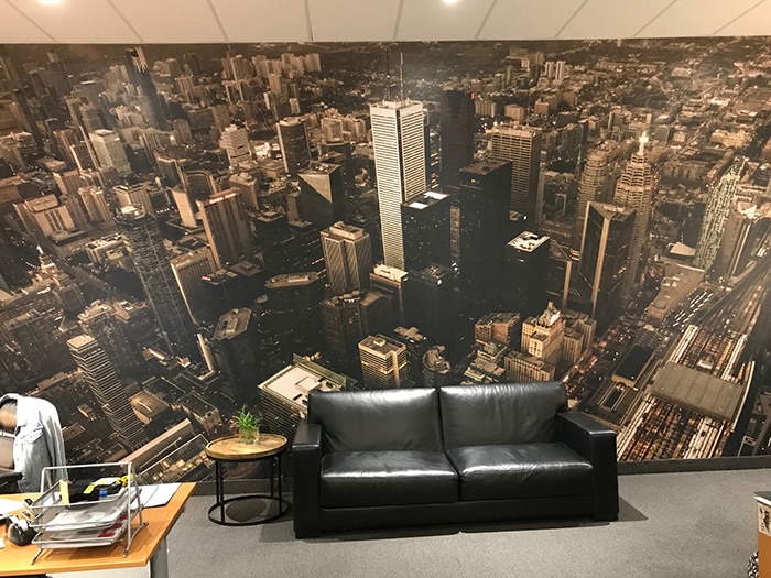
Let us help you create a unique wall. We can work from existing graphics or create something new to compliment your space. The installation process is simple, only a few hours and then you can enjoy the “wow” factor that a full wall graphic brings to an office, retail or even residential location.
Does Print Still Have a Place In the Future of Advertising?
Thursday, April 18, 2019
Does Print Still Have a Place In the Future of Advertising? 10 Experts Weigh In
We came across an interesting article that discusses the future of print and how it still has a place in marketing and advertising.
There is a lot of buzz in the media about where printing is going, but these industry professionals share their thoughts on where print fits into that future. Here are some of the key points they make, please read the full article in the link below to see the expanded explanations.
Print will continue to be valuable where there is a physical customer presence.
Luxury consumers will still value tangible ad platforms.
AR will give print ads a place in seamless omnichannel brand experiences.
Print will need to complement and encourage digital interactions.
Offline entities and influencers will reengage consumers with print media.
Print and digital campaigns will be fully integrated.
Print will allow brands to rise above the digital racket.
Print will remain ideal for hyper-local markets.
Click here to read the full Forbes article for more details:
Reviewing your marketing strategy for 2019? Stay on top of marketing trends by using these leading strategies.
1) Use Old-School Marketing Ideas—Physical brochures, coupon value packs, and brick and mortar approaches to business aren’t gone. Just be sure to use these tools effectively by micro-targeting your customers.
2) E-Commerce Marketing—This is a marketing trend that’s not leaving anytime soon. As e-commerce gets more technology enhancements, you can create an even better experience for your users.
3) Video Marketing—It’s not just for big budget companies. It’s important to use video to create a story for your audience to see.
4) Use Automated Marketing—Accomplish goals in less time with automated tools and use your time more wisely to plan and execute more marketing strategies for the future.
5) Inbound Marketing—B2B companies, take note! Use inbound marketing to bring in prospects, engage them, and provide them with something valuable. Authenticity is key.
From the entire Direction Team we wish you a very Merry Christmas and a Happy New Year!
Here's a tasty recipe for gingerbread cookies to bring you some holiday cheer!
Ingredients:
2 ¼ cups flour
½ cup white sugar
½ cup butter softened
½ cup molasses
1 egg
1 ½ tsp cinnamon
1 tsp baking powder
1 tsp ground ginger
½ tsp ground cloves
½ tsp nutmeg (grated or ground)
½ tsp baking soda
½ tsp salt
Directions: (makes approx. 24 cookies) Note - Mix all dry ingredients together first and then add the wet (egg, butter and molasses).
In a large bowl with mixer at low beat all ingredients together.
Cover the bowl with plastic wrap and refrigerate dough in bowl for 1 hr.
Preheat oven to 350°
Grease cookie sheet with butter
Lightly flour your working surface and your rolling pin…take the dough out (divide dough in half) use first half and then the remaining half. Roll dough out to be 3/16” thick and punch out your desired shapes and place cookies ½ inch apart on a baking sheet.
Bake for 10 minutes, 12 minutes max. Cool cookies on cookie rack then decorate as desired.
November 11th 2018 marks a significant milestone in history…100 years since Armistice Day, the day when armies stopped fighting World War I. King George V held the first Armistice Day at Buckingham Palace in 1919 and 100 years later we continue to commemorate veterans and the war fallen.
My grandfather (Hastings & Prince Edward Regiment) is buried in Sicily having lost his life in WWII when my mother was a baby. Having had a stepfather (who was in the Canadian Navy during WWII) and having a father in the military, I have been to my fair share of ceremonies over the years. If you are able to, make the time and take your family to a cenotaph in your neighbourhood. Thank a veteran. And continue to support veterans and active service members for serving our country and making the sacrifices that allow us our freedoms.
"Memoriam eorum retinebimus" (Latin); "We Will Remember Them"
Hoping you enjoy the first over-eating holiday of the season and on that note here are some of the things that our team posted on our chalk wall when asked, “What are you most looking forward to eating at Thanksgiving?”
- Garlic mashed potatoes with gravy (can't go wrong there unless you're a vampire)
- Turkey - dark meat (yes!)
- Brussel sprouts (guess to each their own...)
- Yorkshire Pudding (nice!)
- A WHOLE pumpkin pie (that's a winning idea!!)
What are YOU most looking forward to eating at Thanksgiving?
And to our American clients/visitors, guess same question, but you will have to think ahead 1.5 months!
Printing 101: Holding it all Together – Bindery Basics
Thursday, July 26, 2018
Welcome to another Printing 101 blog entry - Holding it all Together – Bindery Basics
Ever wonder what the best way to bind your project is? There are several different options and it really depends on the type of project/preference and the page count. Here is a breakdown of the most common types of bindery for easy reference and comparison.
Saddle Stitching (Stapling) – This is where there are 2 staples put through the stock to hold pages together (sometimes 3, if needed). Great for lower qty page count projects.
Pro’s: Inexpensive and fast to produce, project lays relatively flat when open to a page (not so much for higher page counts), adds minimal weight so especially good for mailing, easy to insert into envelopes
Con’s: Limited page count
Detailed Spec’s: Minimum 8 pages up to 76-80 pages based on 80lb text weight (increments of 4 pages needed for this bindery type). The max. page count is based on best performance - Add’l pages are also possible, but they cause spine creep (see previous blog entry) and the force of the stitching can sometimes create issues of strain on the cover and the center panels.
Perfect Bindery – This is essentially where all your pages are glued together along with a cover that creates a spine for your project.
Pro’s: Can accommodate a lot of pages and creates a very professional finished look, easy to insert into envelopes, spine allows for design/text when on a shelf
Con’s: Takes a bit of extra time to produce (1-3 days), projects do not lay flat when open to a page
Detailed Spec’s: Minimum 48-52 pages up to 310-330 pages based on 80lb text weight (increments of 2 pages okay for this bindery type). There is standard glue available for shorter term catalogues and a PUR glue, which is much stronger for longer term use catalogues to help insure the pages don’t fall out easily with repeated use.
Plastic Coil (Plastikoil) Bindery – This is where a series of holes are punched through collated sheets and then a plastic coil is threaded throughout them and bent on the edges to close up bindery. Available in many colours
Pro’s: Can accommodate a lot of pages, colourful options available, project lays flat when open to a page
Con’s: Takes a bit of extra time to produce (1-3 days, depending on qty)
Detailed Spec’s: Minimum 20 pages up to 290-310 pages based on 80lb text weight (increments of 2 pages okay for this bindery type). Standard colours are black and white, but there lots of other colours are available (some are special order). A bonus is that this bindery type could be opened up if typos are found on a page so that it can be swapped out (vs. having to reprint the whole project.)
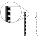
Double Loop Wire (Wire-o) Bindery – This is also a method where a series of holes are punched into collated pages and then a metal double loop wire is put in and then pressure closed (squeezed).
Pro’s: Can accommodate a lot of pages, project lays flat when open to a page,
Con’s: Takes a bit of extra time to produce (1-3 days, depending on qty)
Detailed Spec’s: Minimum 20 pages up to 240-260 pages based on 80lb text weight (increments of 2 pages okay for this bindery type). Black and dull gunmetal or gloss metal are standard. Other colours available, but will be special order. As with plastic coil, this bindery type could be opened up if typos are found on a page so that it can be swapped out (vs. having to reprint the whole project.)
Here are some add’l types of bindery available:
Corner Stitching (stapled corner) – This is just as it sounds, a staple put into the top corner of a project to hold the pages together. Some projects are done this way for economy or simplicity.
Case binding (hardcover) – This is for high-end books or catalogues meant to be kept around for a long-term use. Expensive when compared to other options.
Loop stitching – This is sort of a version of saddle stitching that is designed to include a handy loop so that you can put your project into a standard binder (vs. having to do 3-hole drilling).
Plastic Comb (Cerlox) – While similar to double loop wire (Wire-o) this type of inexpensive binding is most common in copy shops or educational institutions. Simple to be put together but tends to come apart after a lot of use (as it’s just tension on the loop of plastic and nothing is permanently attached).
Feel free to contact us if you’d like to know more about different bindery options and what might work best for your project. We’d be more than happy to provide a sample for your review as well!
Welcome to another Printing 101 blog entry - Weighing in on Paper
If we are going to talk print, let’s start with a vital basic – PAPER.
You’ll find the widest variety of papers available when you are running an offset print project, as the presses have flexibility to handle different thicknesses and coatings. The presses currently used in digital printing have a more limited tolerance for paper options.
There are four criteria used to grade paper - weight (thickness), texture, brightness, opacity and the combinations can become overwhelming. If making a paper selection seems like a daunting task, the easiest solution is to request a suitable “house stock” be used for your project.
The most essential paper specs to note are the paper weight and whether or not the paper has a coating.
Text Weight – used in applications like the interior pages of a book. Typically measured in pounds (lb. or #)
Cover Weight –used in applications like booklet covers, greeting cards. Typically measured in points (pt.)
A list of paper stock recommendations for some commonly run print projects:
FLYER
80lb text to 100lb text
BROCHURE
100 lb text
POSTCARD
12pt or 14pt cover
BUSINESS CARD
14pt or 16pt cover
MULTI-PAGE BOOKLETS
80lb text for booklet cover & interior pages
OR
12pt cover weight for booklet cover & 80lb text for interior pages
PAPER COATINGS:
Any paper weight can have a coating applied during the manufacturing process and it will affect the way that inks are absorbed in printing and therefore how colour comes out. These are coatings that are right on the stock, (not to be confused with the additional coatings that can be applied on press during the printing process – that’s another blog topic!)
So which coating to choose is largely a creative decision ;) The three most popular coatings are gloss, matte or uncoated.
Gloss – adds a reflective shine and makes colours pop.
Matte – adds a subtle silky sheen.
Uncoated – no coating is applied. Inks soak in to the paper and give images a softer look.
For the more adventurous print buyer - have a consultation with your Direction Printing Account Rep to discuss the array of paper options and to get samples (always happy to review & share samples!)
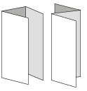
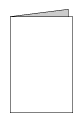
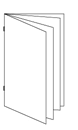
Printing 101: Flyers vs Brochures vs Booklets?!...Let’s talk about the differences...
Thursday, May 3, 2018
Welcome to another Printing 101 blog entry - Today we're going to talk about Flyers vs Brochures vs Booklets and their differences….
A Flyer is a single sheet of paper (that doesn’t actually fly ;) or will it?), typically sized to 8.5x11 (can vary slightly larger/smaller) and can be printed on one or both sides. Flyers are best for short term use or quick messages like advertising a particular sale, event upcoming etc. They are most often produced on text weights as that helps to keep the budget in check.
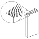
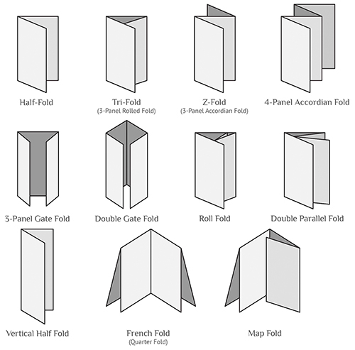
Brochures on the other hand are printed on both sides and can be folded in a variety of ways, as shown below. Oh, how I love a good illustration! Generally, brochures are printed with the intention of being well handled and kept around, so they are best printed on a more durable paper with a protective coating like AQ. What’s AQ you’re wondering? An abbreviation for aqueous, meaning a water-based coating that helps to prevent finger printing, seal in the ink and speeds up the dry time. AQ ensures your marketing materials get out on time, increases the longevity and look super sharp!
Some cool folds to target your audiences…
And last but not least what’s a booklet?!… booklets are bound containing multiple sheets … an easy rule… if your job doesn’t require binding it’s not considered a booklet to us. They are typically a main marketing tool that’s printed with AQ, using a combination of text and cover weights.... a show piece to be appreciated.
Booklets can be bound using a variety of methods, but most commonly by the use of staples (sometimes referred to as saddle stitched or corner stapling), wire-o binding, plastic coil binding, loop binding or using glues ie perfect binding. There’s a lot to say about booklets....and of course more fun illustrations to add in, so this topic needs to be continued, stay tuned …..
To summarize:
Flyers - a flat sheet of paper, printed on one side or two.
Brochures - flat sheet of paper, double sided and folded… there are many folds to consider.
Booklets - multiple sheets bound together, two sided… many binding styles available.
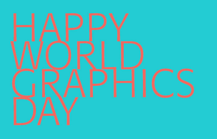
"27 April, Icograda's anniversary, was designated World Graphics Day in 1995. It is an opportunity to recognise communication design and its role in the world.
Design shapes our world in every way, affecting our understandings, opinions, actions and decisions. Design determines the impact of information, whether it be through colour, form, or type, including the smallest street sign, the websites we browse, the products we purchase, or the books we read." - ico-d.org
We at Direction want to celebrate how design impacts our lives from the packaging that helps you identify ingredients and nutritional information in your food, the signage that guides you on your way to work or even the conundrum created when trying to choose which mustache t-shirt to buy!
Hoping everyone can spend 5 seconds thinking about how much design effects their lives on a daily basis!
Cheers to all the graphic artists out there working hard!
It’s officially now spring – as a print provider I have golf and colour on my mind. You can play each hole employing several strokes to get the ball in the cup – or you can figure out how to play in the zone and drop the ball in one stroke. Problem solving on a new client’s project has reminded me of the benefits for adding a Pantone colour to offset print projects and effectively scoring a “hole in one”.
A little background on Colour Systems
Process
Offset printing creates the illusion of “full colour” using four process inks - CMYK (Cyan – Magenta – Yellow – Black). Varying amounts of these four primary inks generates the array of colours.
Pantone (PMS)
Pantone Matching System (PMS) is a proprietary colour space used in a variety of industries, primarily printing. By standardizing their colours, different manufacturers in different locations can all refer to the Pantone system to make sure colors are consistent. In offset printing, PMS inks offer a tonal range that CMYK inks do not - including specialty inks such as metallics and fluorescents.
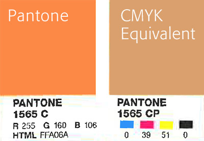
In the case of our NEW client – they came to us with print samples showing their company logo and their corporate orange was not consistent from project to project or even from page to page within their catalogue. Their corporate/brand identity was something that they considered colour critical and up to the point of meeting us - it hadn’t been resolved.
As a first step, we tested colour swatches in a variety of CMYK combinations and none were quite right. Then we recommended selecting a PMS colour for their logo as it would produce reliable and vibrant results. Our client opted to go this route PMS #1565 and they’re relieved and happy with the predictable results this produces. We scored an ace with our NEW client by solving their colour dilemma.
For comparison, here is a scan of the Pantone swatch shown next to the CMYK equivalent:
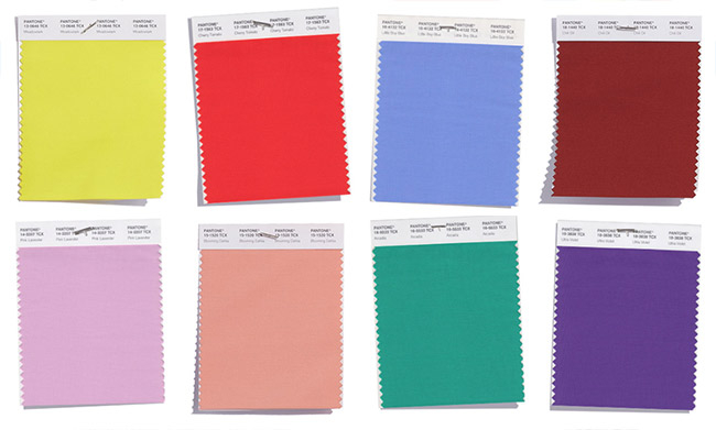
What’s your favourite colour from the Pantone Spring 2018 collection?
Fav Spring 2018 Pantone is Meadowlark 13-0646 - sporty!
TOM ANDERL
March 29, 2018 at 10:38 AM
PANTONE 17-1563
Cherry Tomato - It's just so bright!
Blog
What are some of our customers saying?
Friday, February 23, 2018
We strive to provide our clients with the best overall experience on their projects. From point of order to delivery, we want to make sure that we’re getting “two thumbs up” from you! Don’t just take our word for it, here is some of the feedback we’ve received this week:
“I just wanted to reach out and thank you for all your help with the job. We received the catalogues last week and they look great, it’s kept our shippers busy in sending off to our distributors! The quality of you and your team’s service throughout the process was exceptional. We are very happy!”
“When the planners came in, people were so excited about them there was buzz through the office. It was a huge project, and—as always—on a short timeline. The print quality is beautiful, the colours are rich, and the result is a hearty, practical product that people are excited to use.
Despite our projects often being of an “ASAP,” “quick turnaround,” “strange request” nature, anything we throw at you is taken in stride. From the quoting process, all the way to your lunchtime hand-deliveries, I always feel like our work is handled with a special attention.”
Kaytlyn, Graphic Designer – Magazine Publication
“I can tell you our experience with your team has been quite positive, really appreciate your fantastic service.”
Adam, General Manager – Family Recreation Facility
“Just received the Schedules and I thought I’d let you know that they look GREAT! Thank you so much for all your help and hard work with this project and for always doing a great job with our printed materials. :)”
Soni, Senior Graphic Designer – Non-profit Community Organization
“Hey guys – just wanted to say the booklets look fantastic, thanks so much!”
Connor, Graphic Designer – Museum and Exhibit Space
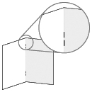
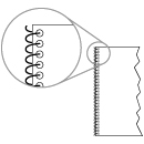
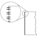
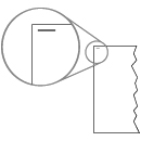
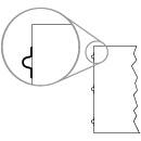
Printing 101: Spine Creep – A horrible spine disease or a layout tip?
Wednesday, January 10, 2018
Welcome to our Printing 101 series – these blog entries will be geared to discussing print terms, hacks, processes and design tips.
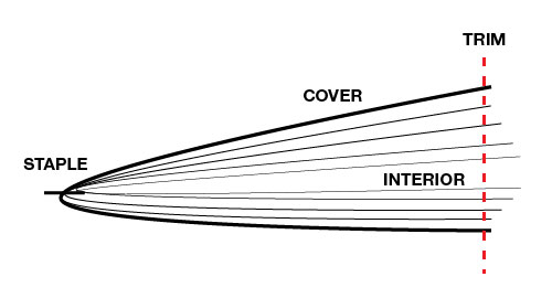
So “spine creep”, what is it? Some kind of horrible disease you wouldn’t want to get?
No, spine creep (or page creep) is where a saddle stitched project’s centre-most pages stick out further along the trim edge. So, if you have a 16-page saddle stitched document on an 80lb text stock, nothing to really worry about. But if you have a project with heavy stock or something more than 24-pages, your centre-most pages will stick out further than the cover and when the final trim is done, they will be short trimmed. You will lose some information within your layout on those centre- most pages unless you adjust your margins to account for this.
Here is a visual:
Frustrating phenomena that can sometimes be solved in your layout program (or sometimes by prepress). General rule of thumb is if you have a lot of pages and you are choosing saddle stitching it’s best to keep the creep in mind and keep page numbers or other content that may be near the trim clear of that edge.
It’s that time of year – egg nog, jellied salad, ugly sweaters…
We always look forward to working with you, but at Christmas we like to take some time to spend with family. So, it will be regular business until Fri Dec 22nd - then closed the week of Christmas – reopening Tues Jan 2nd. We’ll be back refreshed, 5lbs heavier and ready to take on the New Year.
From the entire Direction Team - Merry Christmas and Happy New Year!
Hello! Welcome to the new directionprinting.com – Grab a coffee and stay a while...
We have worked to incorporate more content about who we are, what we do and more importantly what we can do for you and your business! Our new site obviously lets you read all about our company and the services we offer, but we’ve now added additional resources and specials that will be updated regularly, so check back to see what the current deals are.
We’ve also added a blog where we will post what’s new at Direction, explain a print term or process to expand your print knowledge or just report in on something new and exciting within printing. Or a killer chili recipe, you never know what will pop up…
Thanks to all our current clients for choosing Direction and we look forward to meeting some new faces and showing you The Direction Difference!
Posted by Tom Anderl on Wednesday, August 16, 2023
Trade shows and events can be a great way to network and gain awareness for your company outside of typical marketing. They allow you to get more personal with potential customers, talk face to face, and give them incentive to come back later. One of the best ways to ensure that you aren’t forgotten after they leave your booth is brochures.
Brochures have been used for years as a way to market beyond just your booth at an event. They allow you to stay in customers’ minds for longer and share important information about your company.
Not only that but brochures allow you to use both text and images to sell your brand. They also help you tie in all aspects of your company. This is why brochures still matter and how you can make your standout at a trade show.
Why Brochures Still Matter
You may be asking, but do brochures even matter anymore? How many people actually use them or read them? Well, you would be surprised.
When you are at a trade show you have maybe 5 solid minutes to sell your company to a new customer. Then they will walk away to another booth or get distracted by something else. Trade shows are busy, and the floors are typically packed, so what do you do when someone walks away after only a 5-minute sales pitch? You give them a brochure.
Brochures are a great way to continue selling your brand. They are small and easy to hand out while you are talking to someone. Or you can have them displayed on your booth so people can grab them before they leave. Or have someone hand them out to people passing by that don’t have time to stop. They allow you to stay in someone’s mind even after they leave. They also allow people to continue to revisit your brand when they have more time after they get home.
Brochures are still very relevant today. Even with technology being people’s main go-to for marketing, brochures can still be very helpful. A lot of times people attending these trade shows still prefer to have some form of physical media to take with them. Or depending on your target audience, they may prefer physical media to technology. So, don’t discredit brochures, as they are still the number one selling tool for trade shows and events.
Tips for Making a Good Brochure
Not only is it good to have brochures to hand out at events, but they also need to be relevant, eye-catching, and useful to the reader.
Sure, you could simply whip something together on your office computer and print it off at work. But most of the time, it won’t look great, and it will be poor quality if you are using plain printer paper.
Consider using someone on your design team or hiring outside help to create an eye-catching and good quality brochure. Then, once you have one go to a good printing company, like Direction Printing, and ask to have it printed in the best quality.
Your brochure doesn’t just need relevant information it also needs to look nice and be high quality if you want people to hang on to it.
Here are our tips for creating a good eye-catching brochure to hand out at your next trade fair.
Eye Catching Front Cover
The first thing people are going to see when they look at your brochure is the cover.
It needs to stand out from every other brochure that is going to be handed to them, so you need to create a standout cover with engaging visuals.
It should be bold and colourful and reflect your target audience as well as your company.
The cover of the brochure should set the tone for the rest of it. If the cover is boring, people are going to ignore it and move on to something else. However, if it is intriguing, people are going to want to keep reading.
Start by including an image. It should reflect your company, so either your logo or a product or something designed specifically to represent your company or brand. It should also capture the attention of your target audience. If you are targeting Gen Z, maybe make it bolder and more colourful. If you are targeting people over 50, maybe don’t include memes or Y2K design elements.
Perhaps consider working with a graphic designer to help you design an image or graphic for your front cover. This is not something you should be putting together at the last minute on an old laptop. This needs to look professional as it is a direct reflection of your company. By working with a professional designer, you can ensure that it not only looks good and professional but that it is also of great quality.
Consistent Branding
It is one thing to have your brochure look good and capture the attention of your audience, but it should also match the rest of your branding.
If your company colours are blue and orange and your brochure colours are pink and green, that doesn’t really match. You need to have consistency across all forms of marketing and branding. If it is off, then it makes you as company look bad and like you don’t care.
Not only should the colour scheme match the rest of your branding but everything else should as well. Use the same font you use everywhere else. Don’t suddenly change your logo or key features of your branding. The key is for it to blend in with everything else.
Perhaps consider using the front of your brochure as the model for larger posters around your booth. That way it not only matches your brand but also the rest of the booth and makes that connection mentally for your customers. It will also help them remember which booth they got the brochure from as the image of the poster will pop back up in their minds. This also helps create brand awareness.
Focus on Your Reader’s Needs
A brochure, of course, is not all about visuals. The content inside is the main feature and therefore a lot of thought should go into it.
A brochure needs to keep selling when you can’t. So, it should talk about what your company does, what you sell, how much it costs, and potentially even new deals or products you just added.
However, none of these matters if the customer doesn’t want to buy it or can’t see how it benefits them. Rather than talking about you or your company, talk about how you or your company can help the customer. Customers don’t care unless they can see how something benefits them. Whether it be saving them time or money or even both, they don’t care unless they can see that. Target the brochure to your audience and focus on what your audience needs.
Include a Call-to-Action
After someone is done reading your brochure, what do you want them to do next? Do you want them to give you a call? Go to your office for a consultation? Email a sales representative? Follow you on social media?
You need to consider this when making your brochure because you will need to include a call-to-action.
Ideally you should include multiple calls-to-action that are subtly placed throughout the brochure with one final obvious one right at the end. However, if you are unsure how to do this, one obvious call-to-action right at the end will also do just fine. It should be easy to read, clear what you are asking them to do, and be followed by clear instructions.
It's one thing to ask someone to give you a call or email or visit your website, but if they can’t figure out how to do that then what’s the point. Make sure you are being extremely clear you don’t want them to have to put in any extra work to find the information.
Some key things to ensure you are included are your phone number (company or personal), email address, physical address of your office, social media accounts, and your website address. Make sure these are easy to read and easy to find, typically at the bottom of the last page is a good idea.
Link Them Online
Finally, a good idea is to link people back online. Most of the world revolves around the internet these days and it’s not going anywhere anytime soon.
So, making sure to link people online is a safe bet. Not only are most people already online all the time, but it allows your customers to continue learning about your company. If they follow you on social media, then they will be reminded of you every time you make a post. If you link to your website, then they can continue to learn more about you and potentially buy your products or service right away if you sell online.
A great way to link your brochure back to the internet is through a QR code. Then people can simply scan it without having to type anything into a search engine and be brought straight to whatever you want. It also means they can continue to rescan it whenever they want.
We hope this was helpful and informative on why brochures still matter for trade shows and events. If you are interested in printing some brochures of your own, give us a call or email today and we can get you started.


 Wishing you the very best during this magical time.
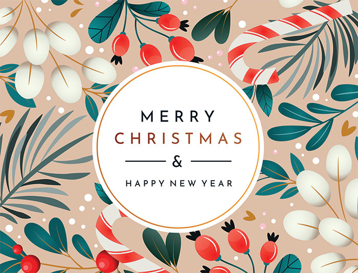


 "27 April, Icograda's anniversary, was designated World Graphics Day in 1995. It is an opportunity to recognise communication design and its role in the world.