
|
Contributors
Latest Posts Show All Recent Posts Archive
Tags Everything |

|
Contributors
Latest Posts Show All Recent Posts Archive
Tags Everything |
To contact a Direction representative, please click the button below:

It’s officially now spring – as a print provider I have golf and colour on my mind. You can play each hole employing several strokes to get the ball in the cup – or you can figure out how to play in the zone and drop the ball in one stroke. Problem solving on a new client’s project has reminded me of the benefits for adding a Pantone colour to offset print projects and effectively scoring a “hole in one”.
A little background on Colour Systems
Process
Offset printing creates the illusion of “full colour” using four process inks - CMYK (Cyan – Magenta – Yellow – Black). Varying amounts of these four primary inks generates the array of colours.
Pantone (PMS)
Pantone Matching System (PMS) is a proprietary colour space used in a variety of industries, primarily printing. By standardizing their colours, different manufacturers in different locations can all refer to the Pantone system to make sure colors are consistent. In offset printing, PMS inks offer a tonal range that CMYK inks do not - including specialty inks such as metallics and fluorescents.
In the case of our NEW client – they came to us with print samples showing their company logo and their corporate orange was not consistent from project to project or even from page to page within their catalogue. Their corporate/brand identity was something that they considered colour critical and up to the point of meeting us - it hadn’t been resolved.
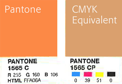
As a first step, we tested colour swatches in a variety of CMYK combinations and none were quite right. Then we recommended selecting a PMS colour for their logo as it would produce reliable and vibrant results. Our client opted to go this route PMS #1565 and they’re relieved and happy with the predictable results this produces. We scored an ace with our NEW client by solving their colour dilemma.
For comparison, here is a scan of the Pantone swatch shown next to the CMYK equivalent:
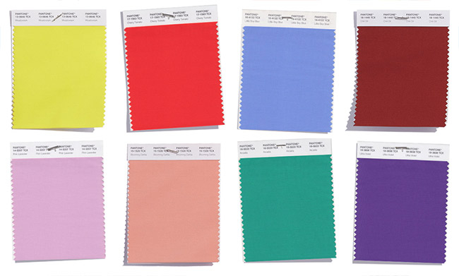
What’s your favourite colour from the Pantone Spring 2018 collection?
https://www.pantone.com/fashion-color-trend-report-new-york-spring-2018
|
|
|
|
|
|